Development of a visual graphic identity (that aligns with pre-existing logo provided by the client), to accompany all communication materials distributed to parents starting from the enrollment process and throughout the entire year
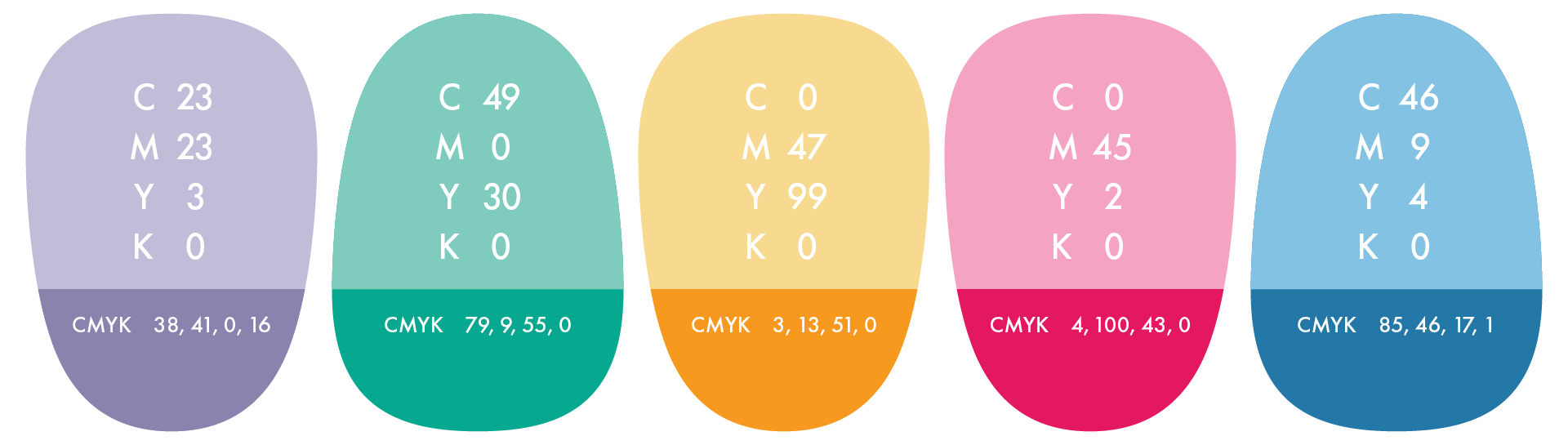
Color Palette
Directly associated with the logo, a vibrant and playful color scheme has been selected, featuring two color palettes: a primary palette of soft pastel colors and a secondary palette of more vivid colors.
Typography
Continuing the soft aesthetic, a handwritten font has been chosen for the headings to give the forms a light and pleasant appearance. For the body text, it was important to use a highly legible font, as despite the desire for a welcoming look, these forms contain or require sensitive and important information.

Grid & Pattern
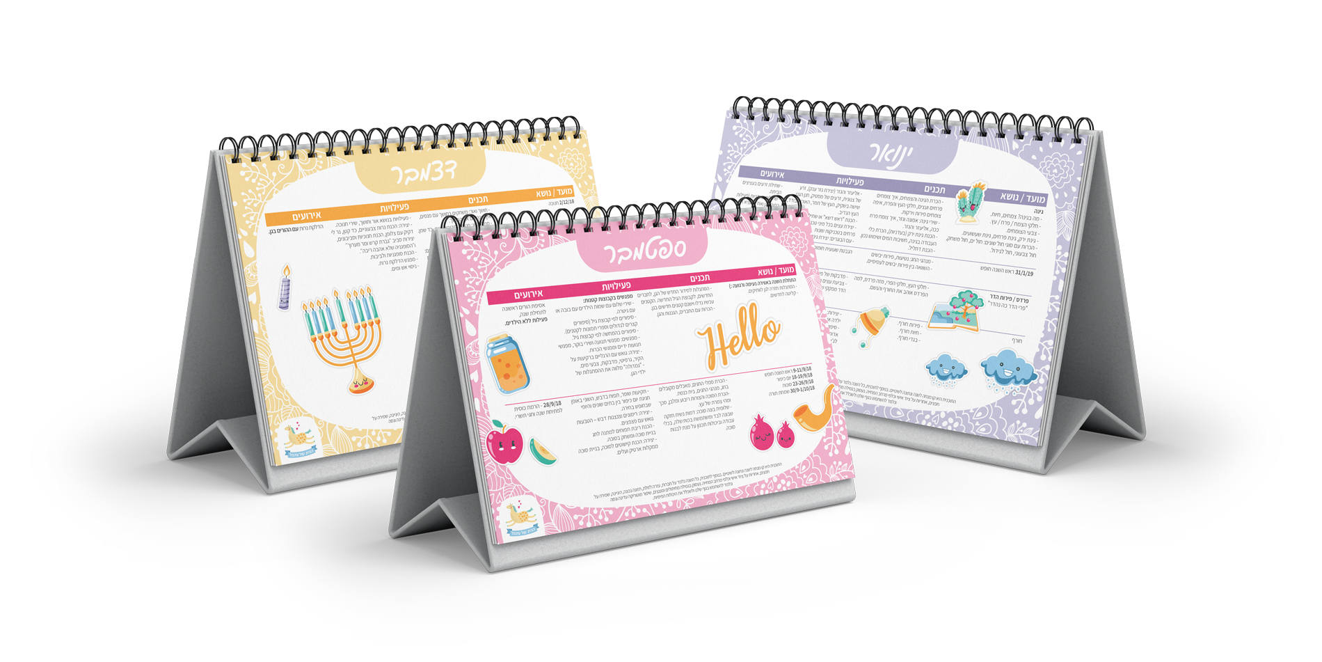
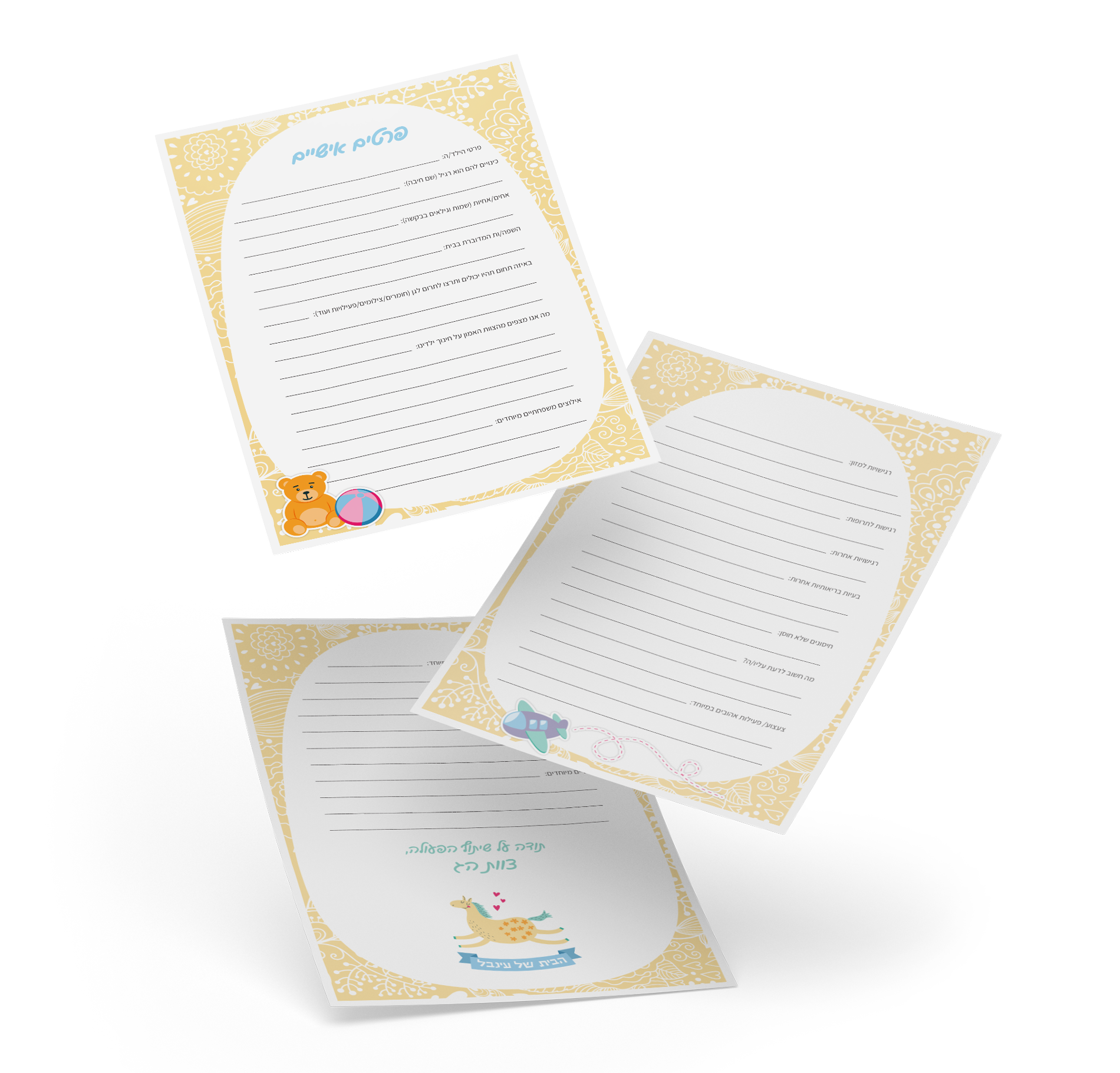
In order to create a uniform look that helps parents easily identify the nursery forms among the accumulating paperwork at home, a grid was designed incorporating a soft floral pattern over a solid background color (that varies between forms) and a white elliptical area for the texts.

Horizontal Grid

Vertical Grid
Illustrations
The use of sticker-like illustrations enhances the aesthetic appeal and reflects the warm atmosphere that the nursery offers to children. Moreover, these visuals serve a practical function as markers related to the topics of the forms, facilitating quick identification during searches or when revisiting the documents


Final Design Examples
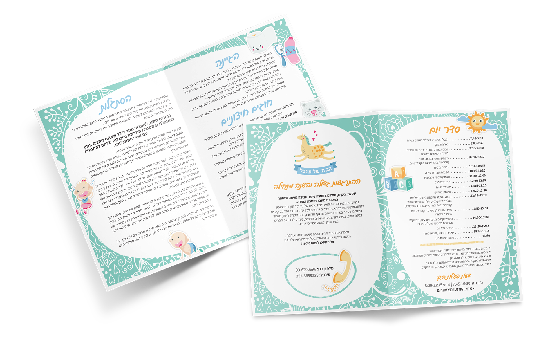
Bi-fold Brochure
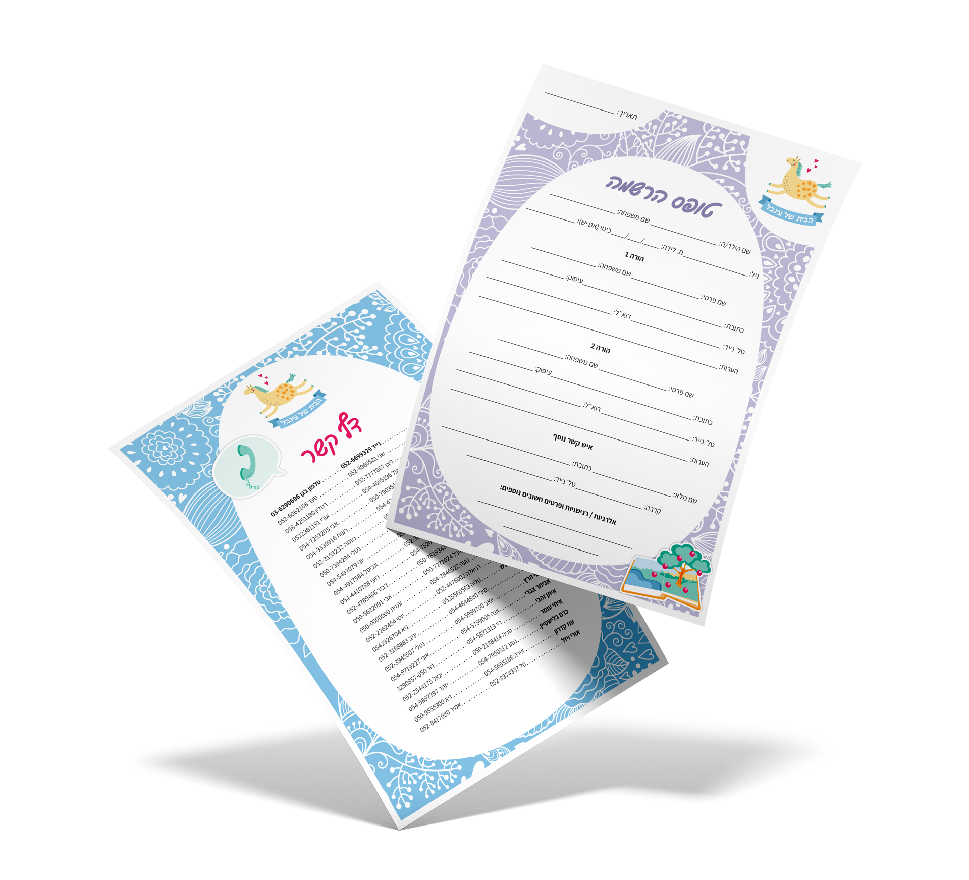
Registration Form & Contact Page
Child Information Questionnaire